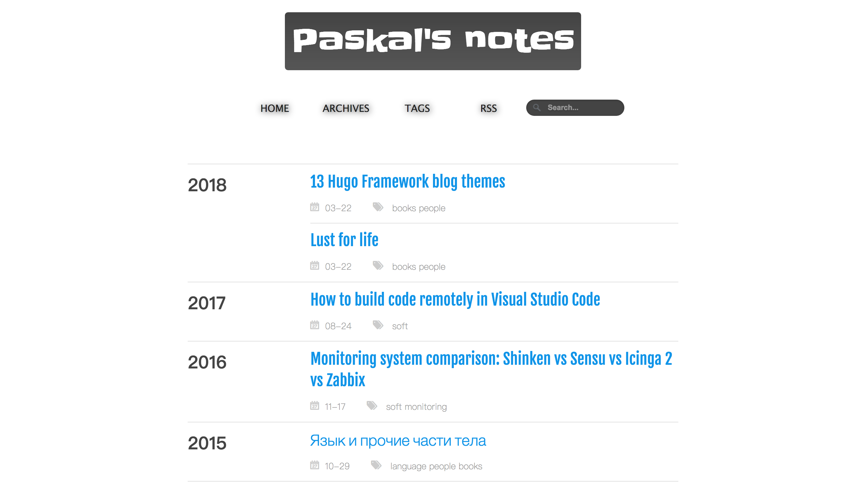
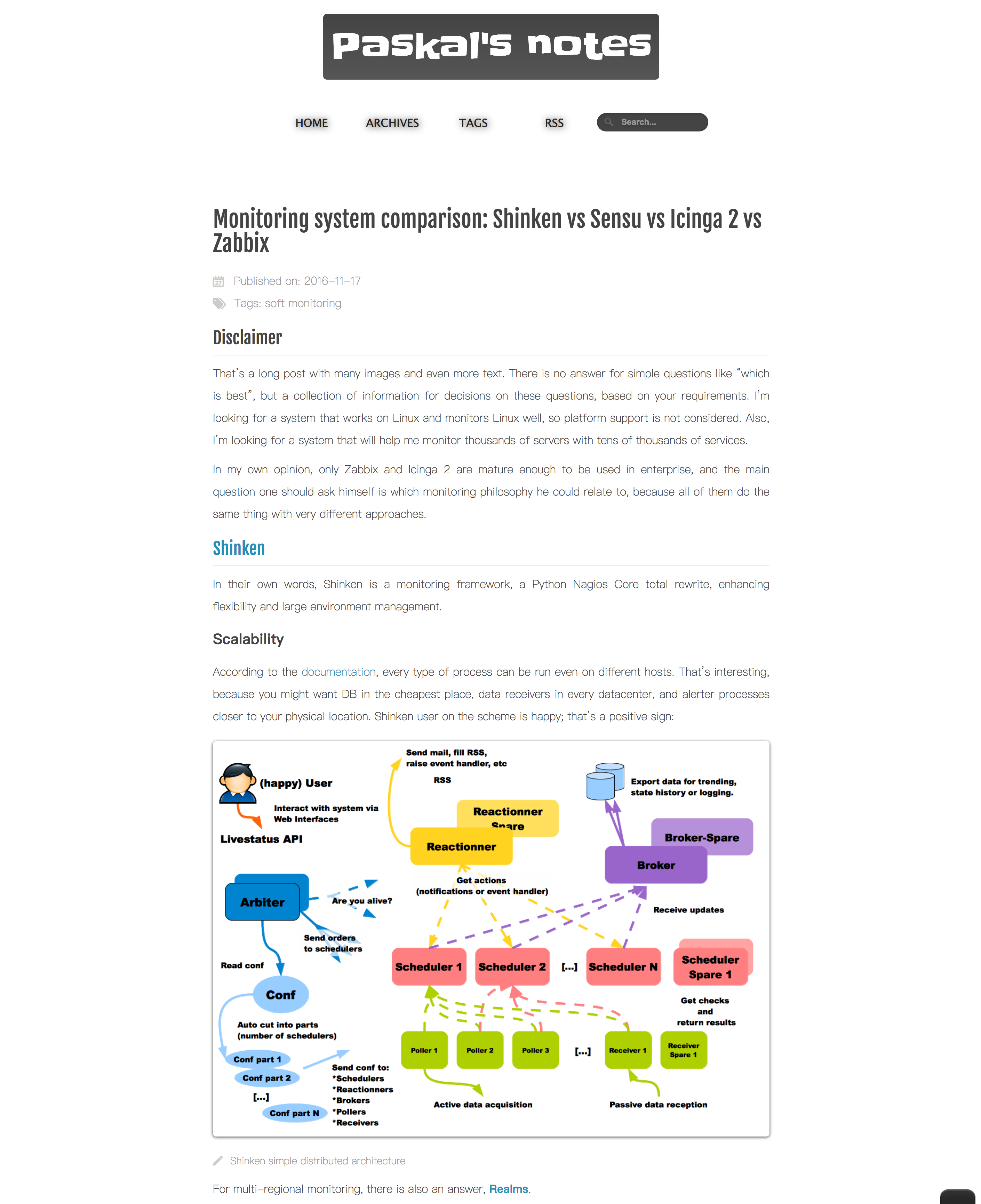
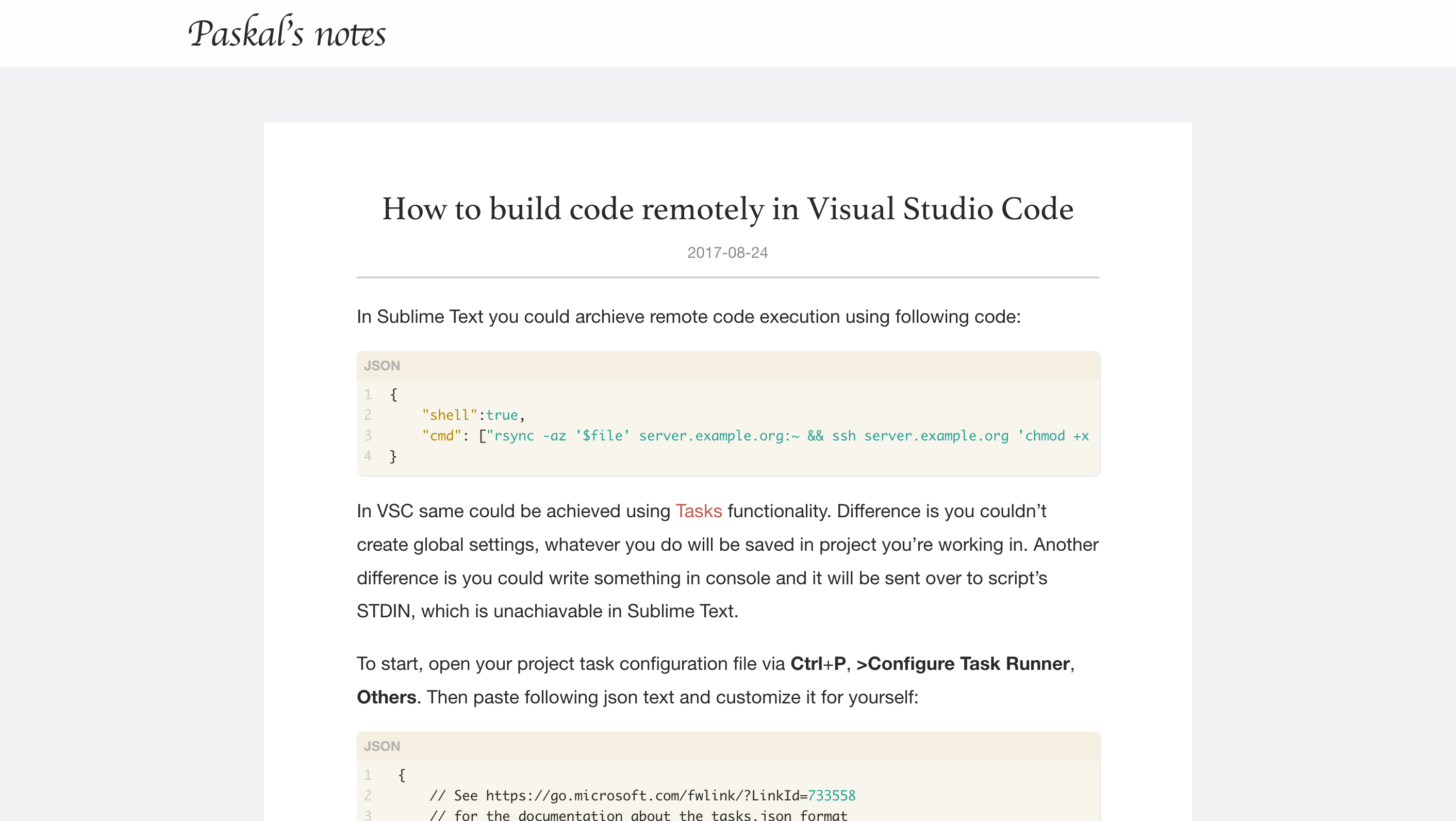
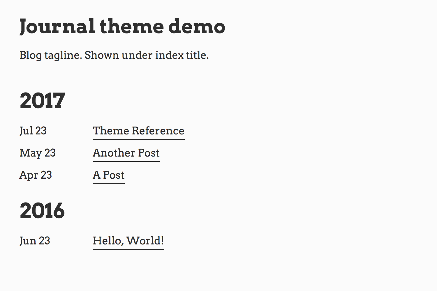
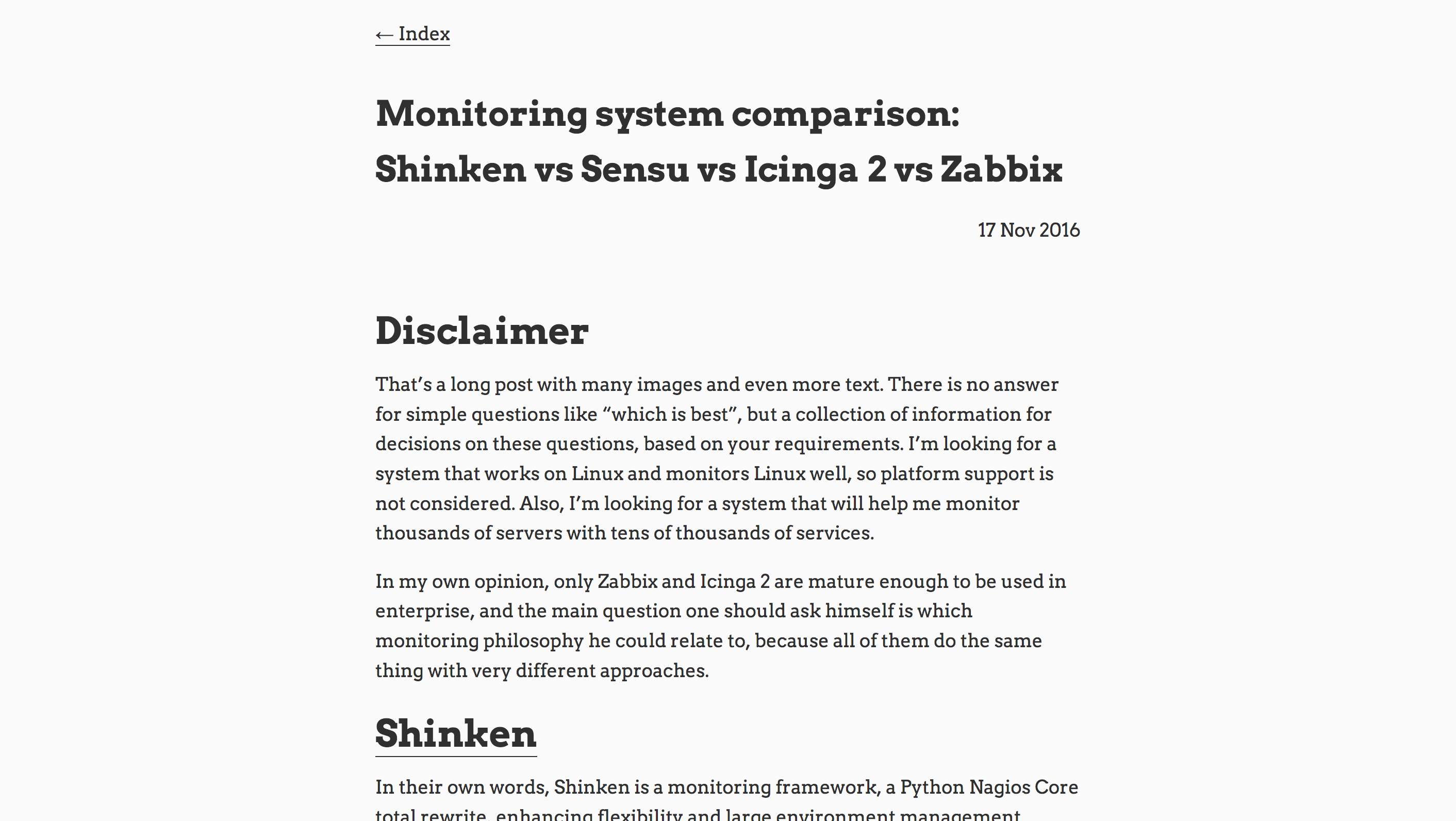
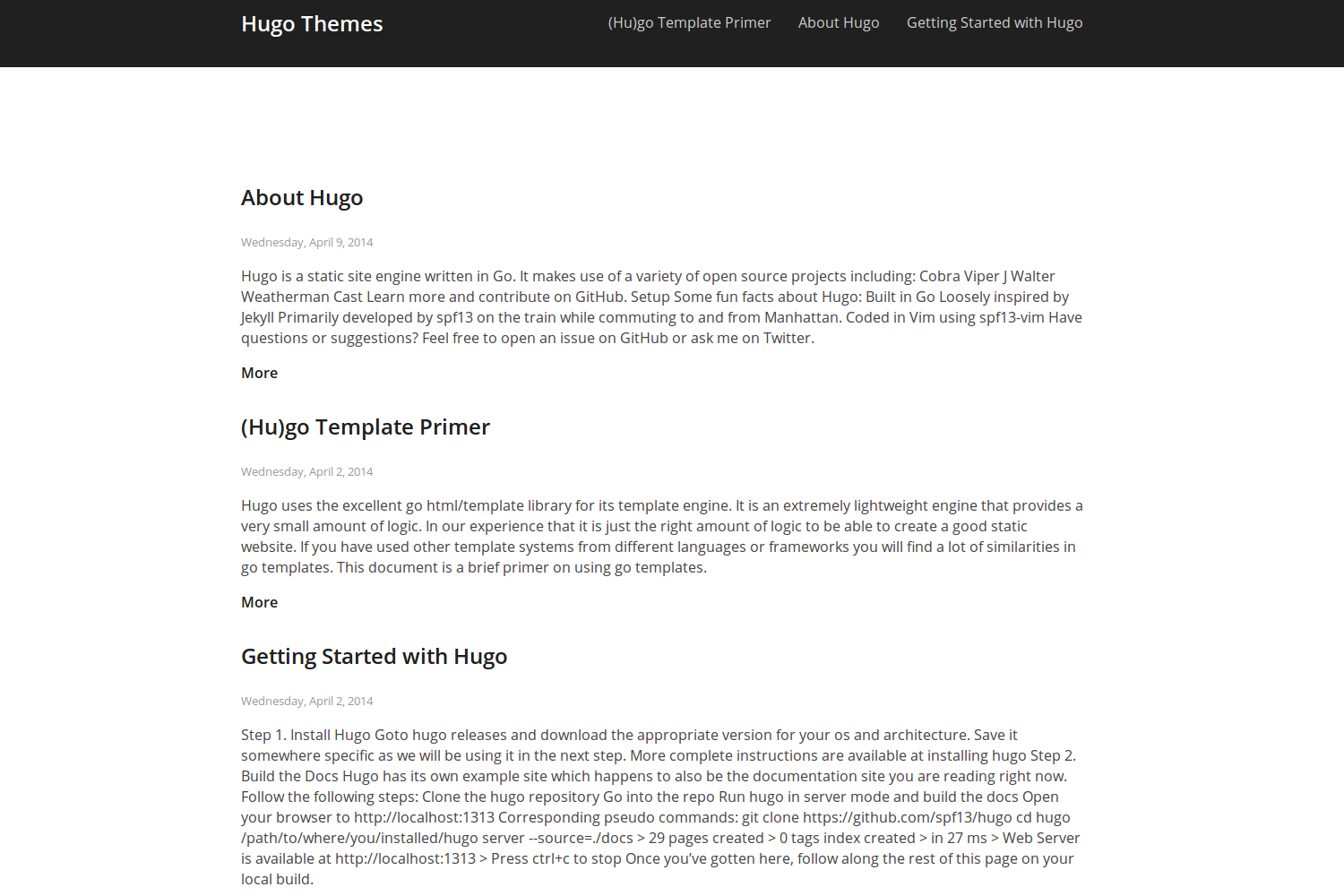
15 Hugo Framework blog themes
I’ve tested all 202 Hugo themes from the catalogue plus three missing from it for basic functionality and picked the best blog-oriented ones. By that, I mean all of them have blog posts shown on the main page, and most of them support posts tags.
All themes below have active developers, and I didn’t include 3-years-old themes without newer commits. I’ll present them in alphabetical order. They’re all fine quality and couldn’t be compared or ranked in any unified way I can think of.
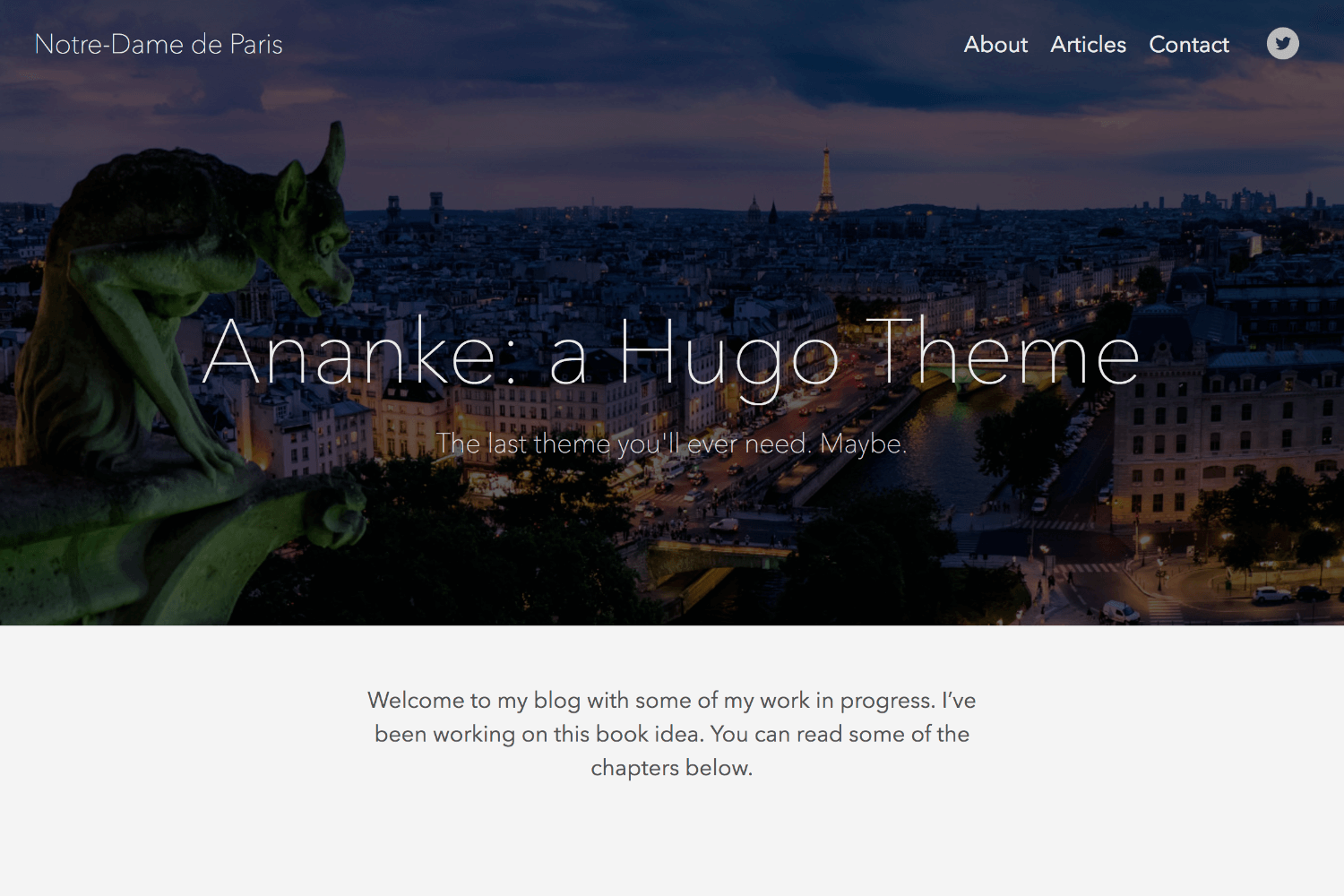
ananke
Main page
I love themes that cut straight to the content, and this is not one of them – when someone comes to your site by URL, they should scroll or click to see posts.
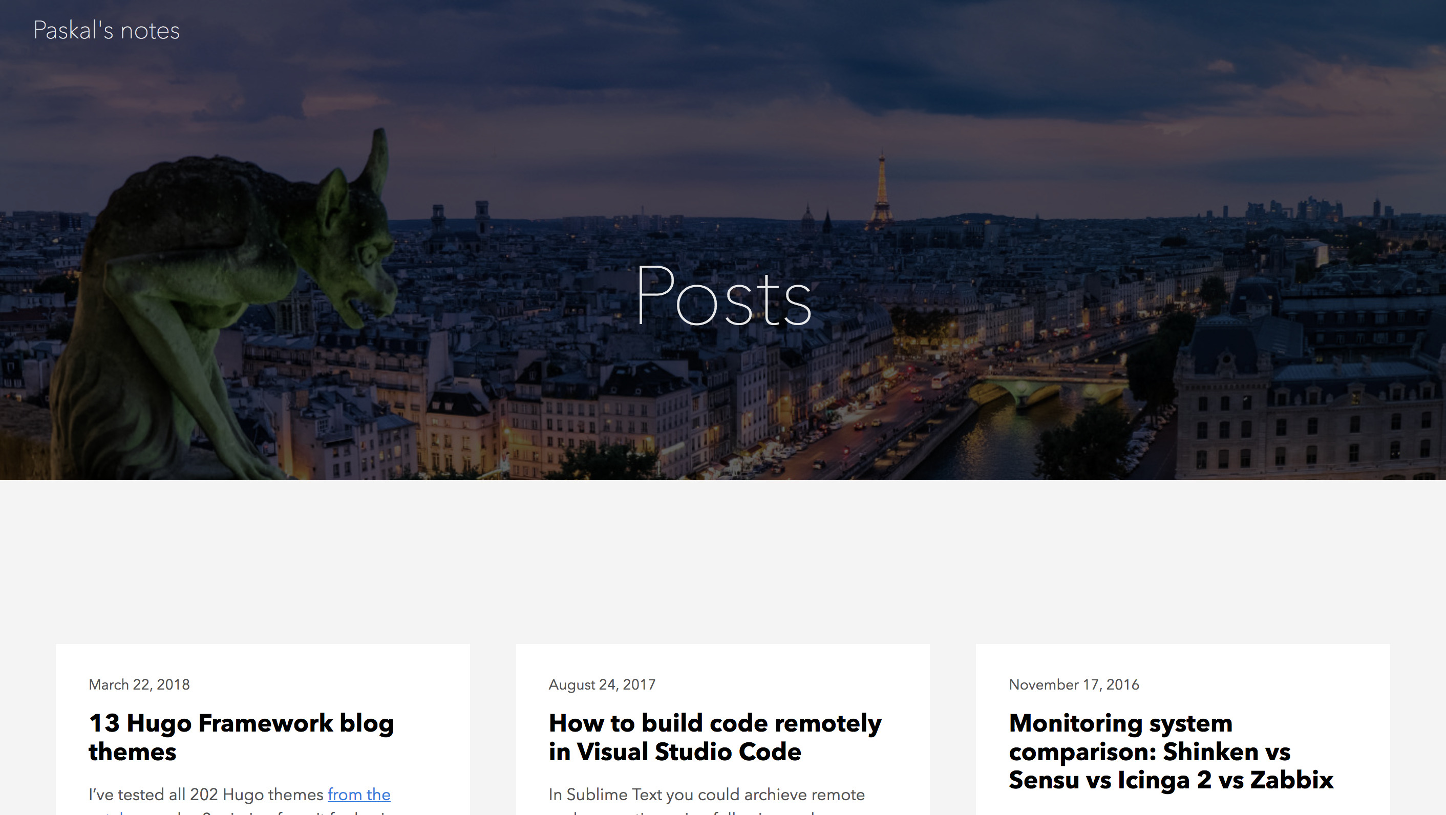
Navigation
For posts, it’s the same as with the main page, a lot of space eaten by the banner. I couldn’t get working tags navigation.
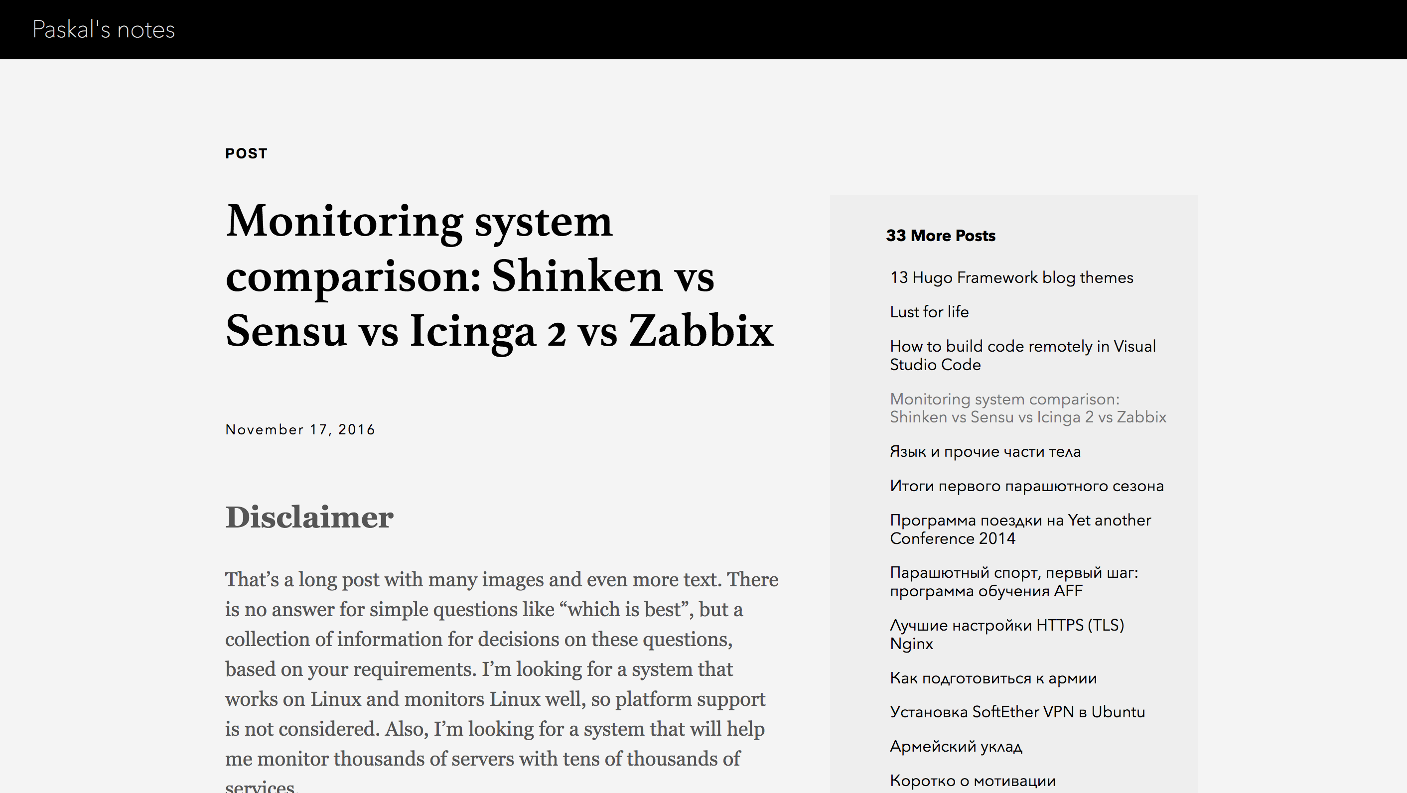
Single page
Nothing extra on the single post page. But a lot of space unused, all posts list on the right, and related articles list at the end of the article, with no Disqus support.
beg
Main page and navigation
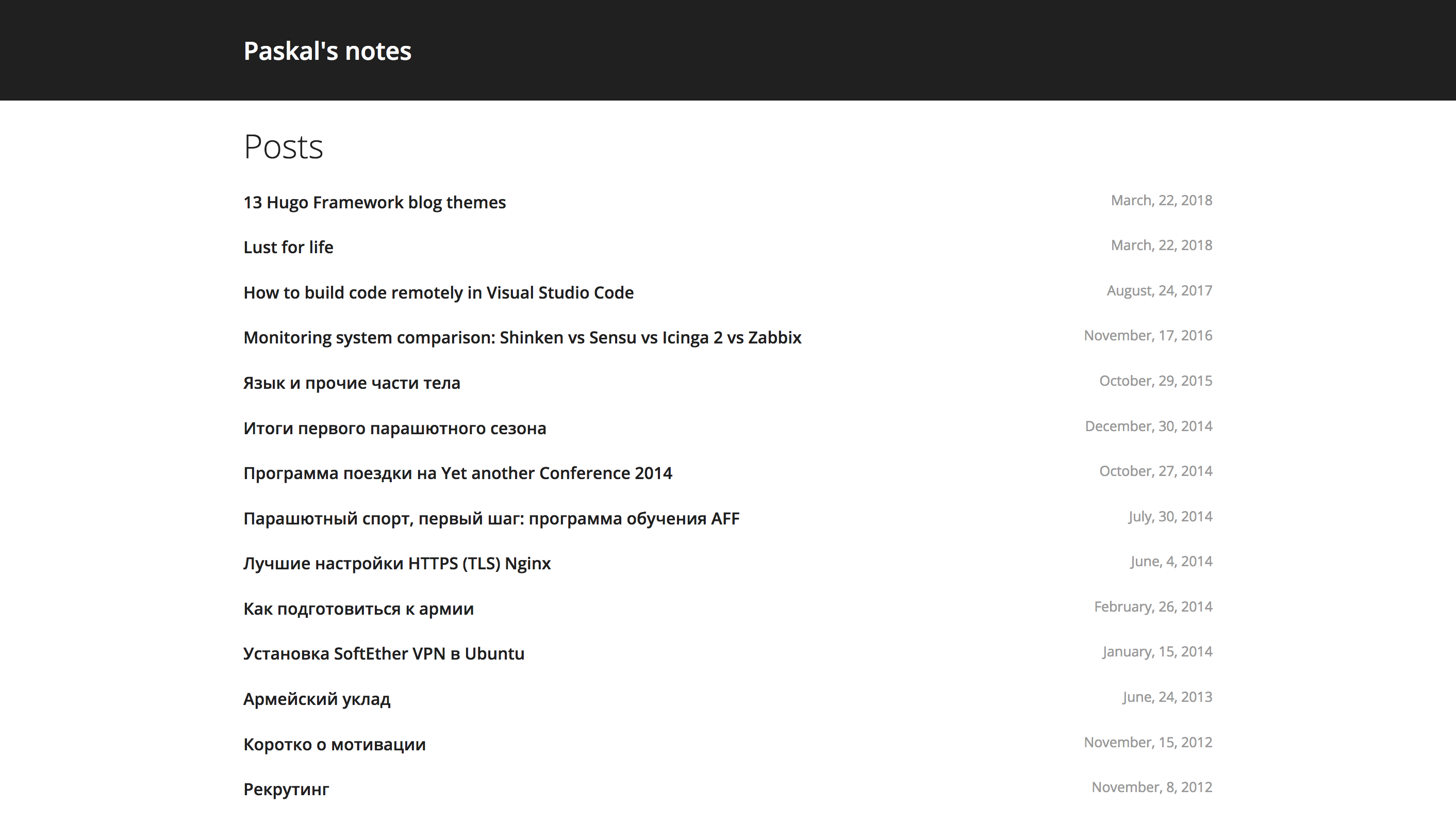
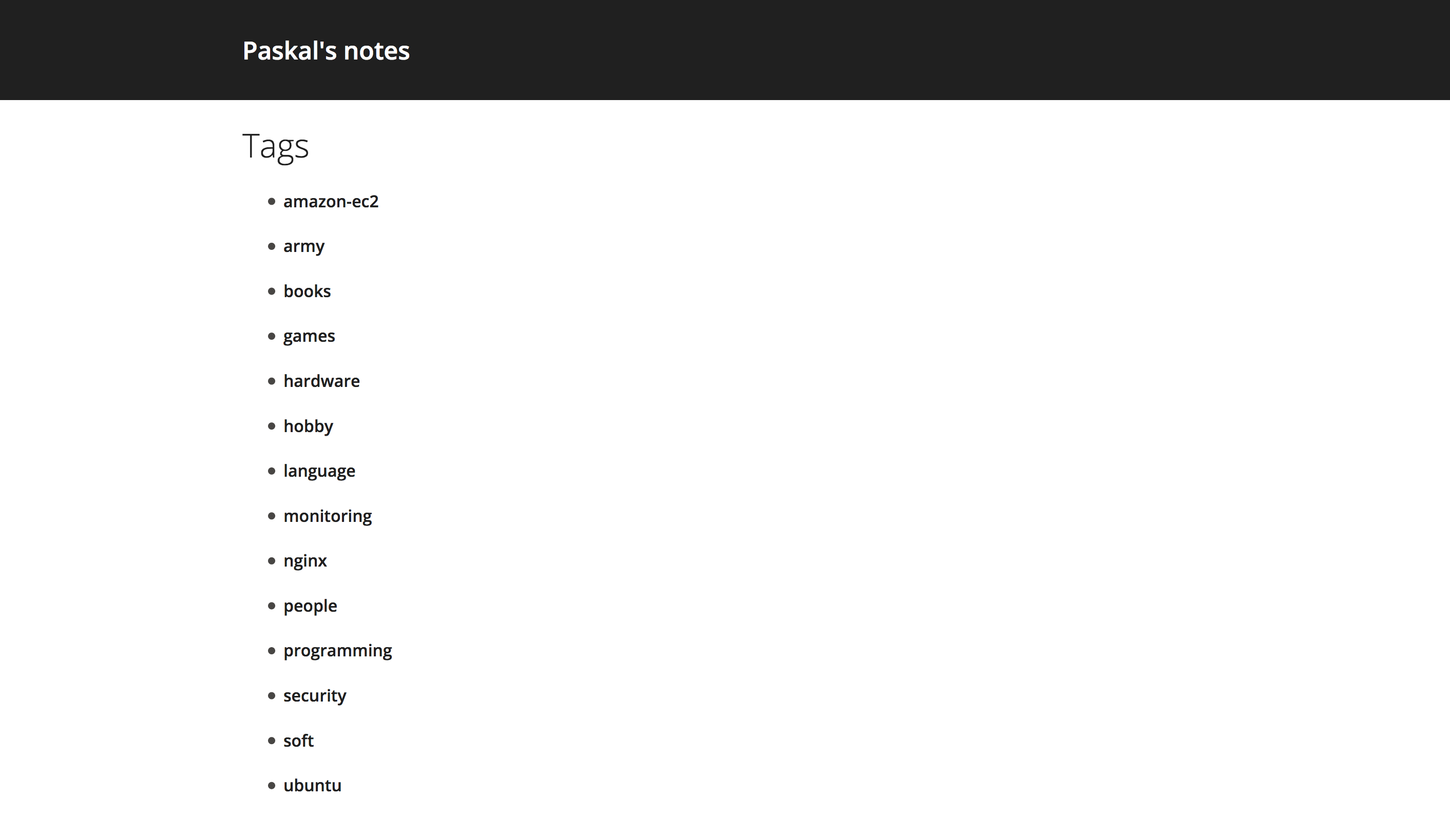
Cut anything that distracts you from reading, add a little navigation to your posts, and you’ll get beg theme. Everything in its place, nothing you don’t want to be there, is present. Navigation looks the same as the main page, only the title changes — you get what you expect, that’s nice.
Single page
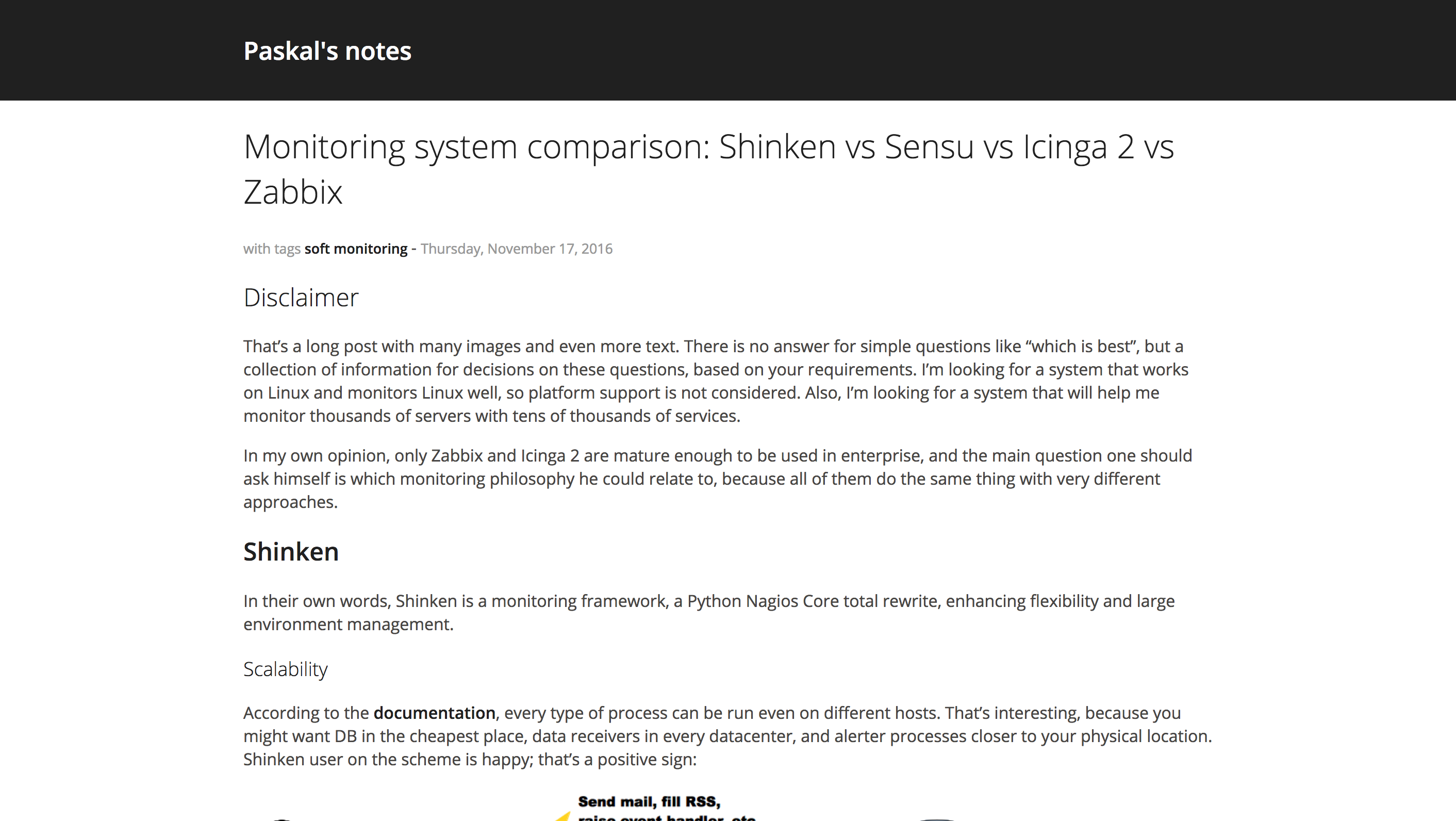
The beginning of the page looks the same as the main page, so that screenshot taken from the middle. The only reason you don’t read this blog in the mentioned theme is this: it renders bold text bold and highlighted, and italic as highlighted text but not italic. That’s the only issue I found after using it for several months, apart from no related articles list present at the moment. It supports Disqus and pleasant from all points of view.
Casper
Main page
A hybrid between having nothing extra apart from the text but navigation and huge banner in ananke. Black and white text, summaries of the posts are present and rendered nicely. The posts page is the same, only the title changes.
Single page
That’s the best text handling I’ve seen so far. Post title, description, tags and time, and then content – nothing special, but then comes the magic: images have a slightly more significant weight than the text. So simple and yet genial. Of course, the theme supports Disqus.
Related articles
Ladies and gentlemen, I want to show you the friendliest approach to the “next article” and “related articles” presentation on the market: one of both in separate boxes, same information but present in such a tasty way you couldn’t stop the desire to click.
Classic
Main page
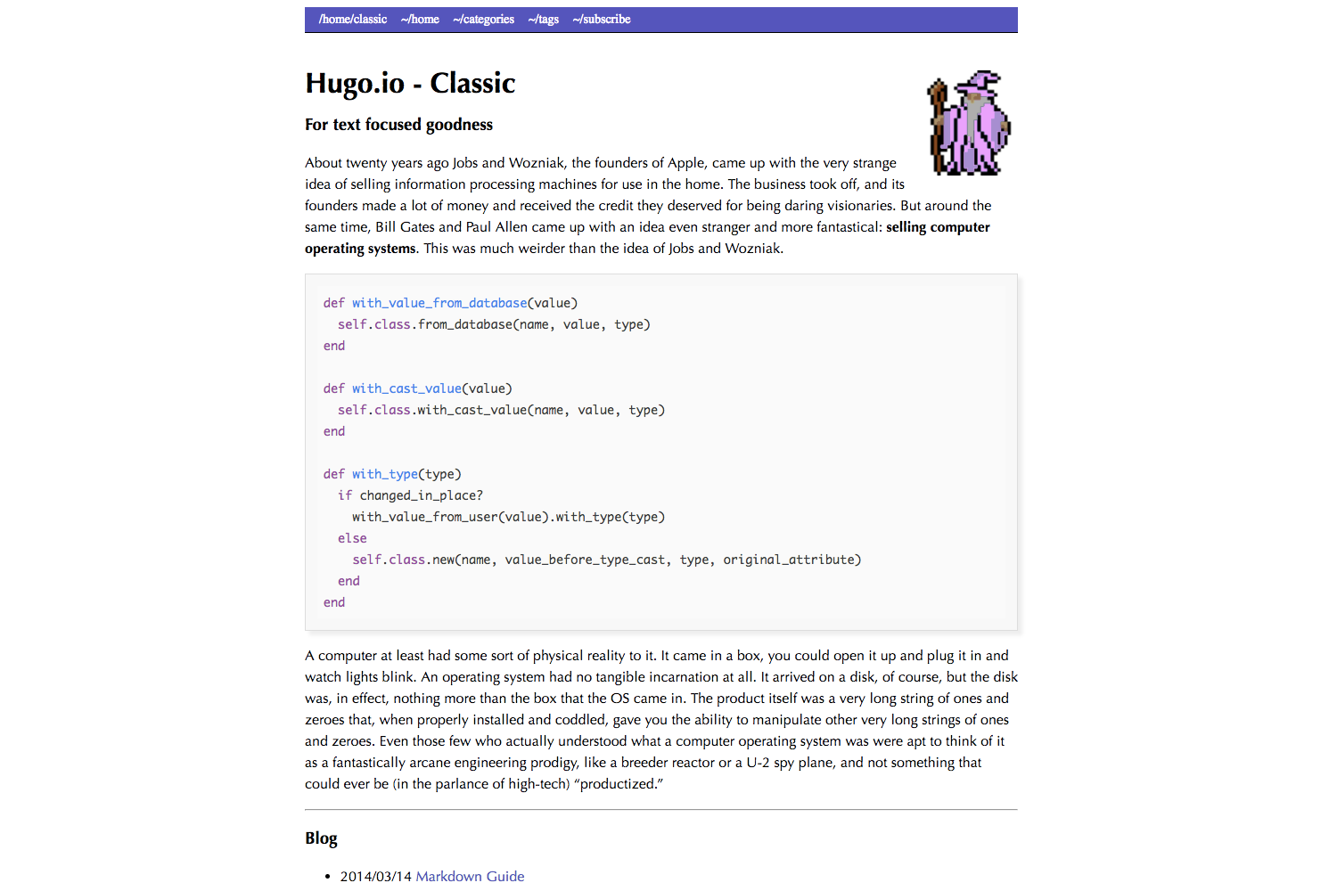
The main page is pretty neat, with no preview for posts: just post names, custom text, and navigation. I almost missed it but couldn’t exclude it from this post when I saw how cool my blog looked like in it.
Navigation
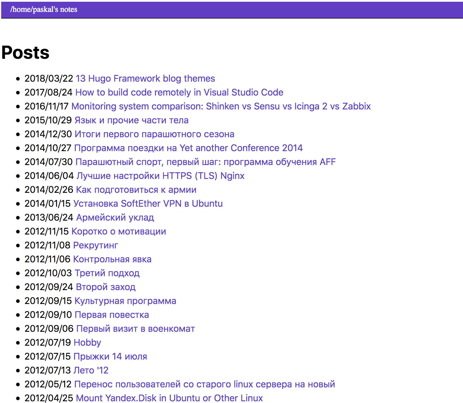
Just text – nothing extra. Hell with the posts’ summaries, that’s classy.
Single page
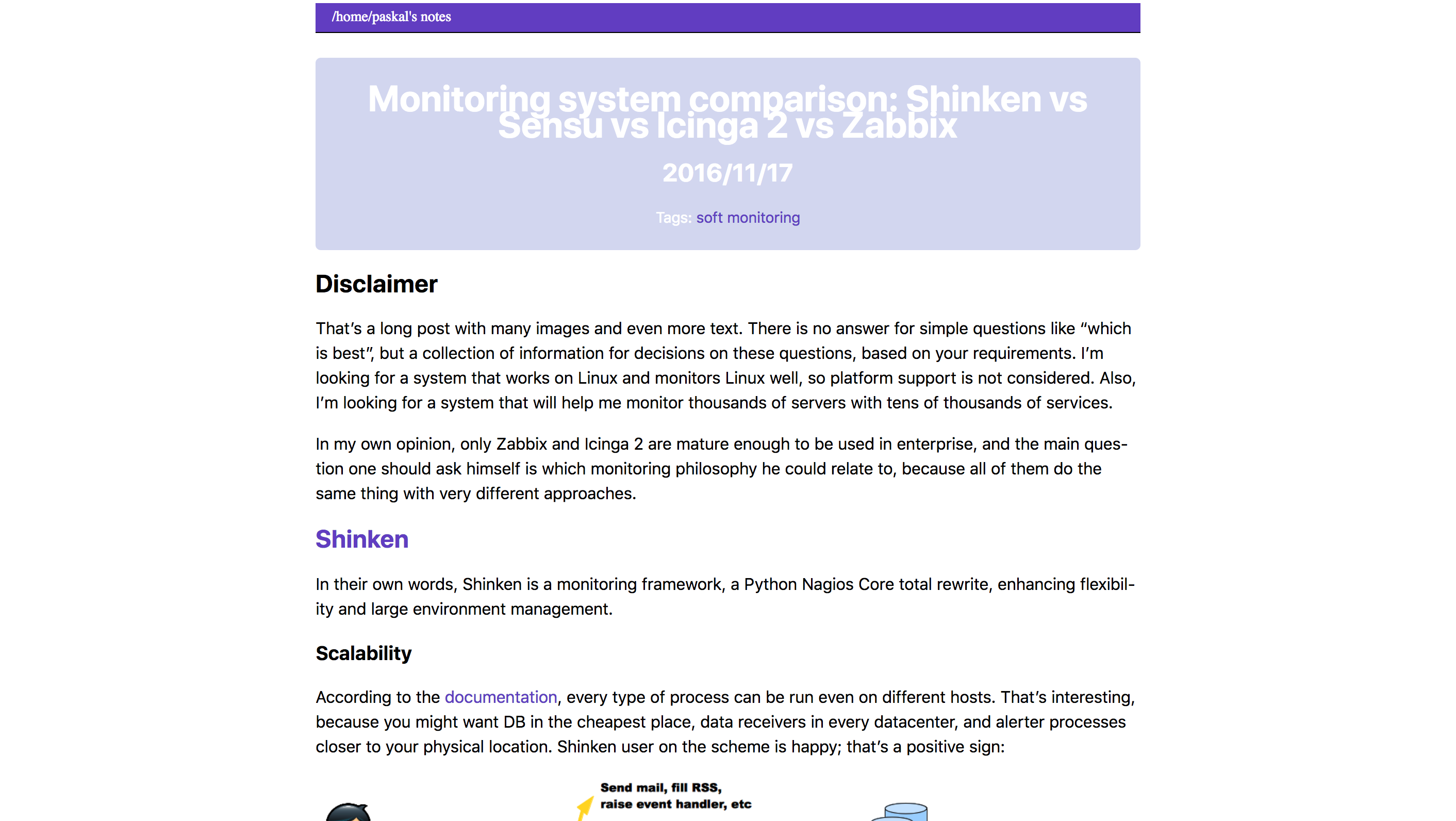
Text with a fixed width, a sign of good taste. However, minimalism means there is no Disqus support out of the box. Formatting is what you could name “plain”, nothing special, but everything in its place – well-balanced and excellent.
coder
Main page
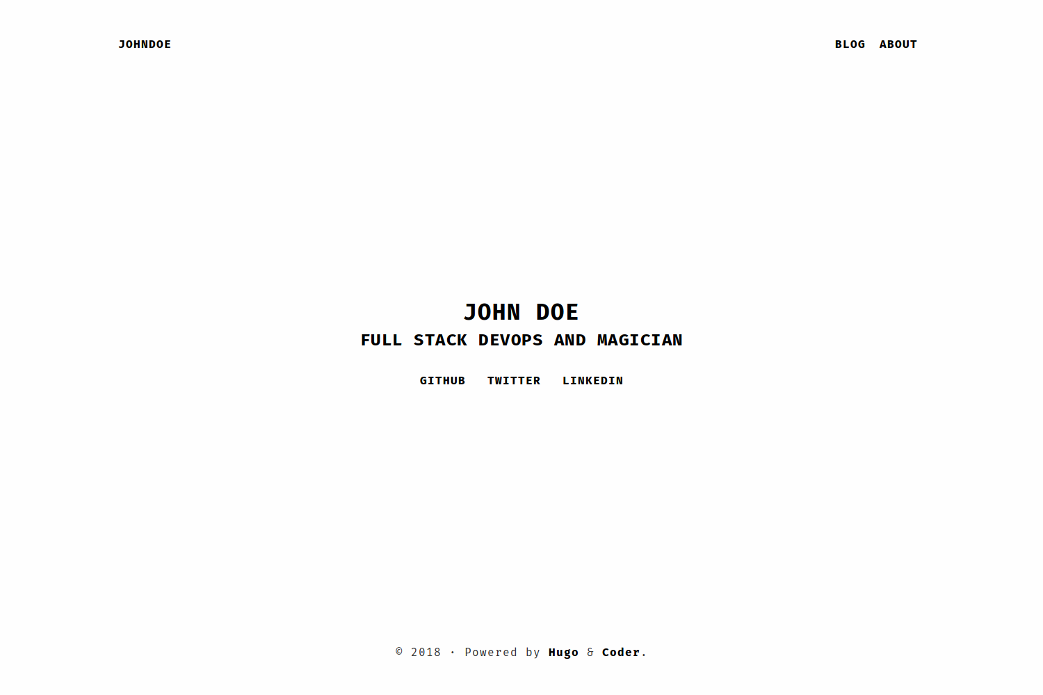
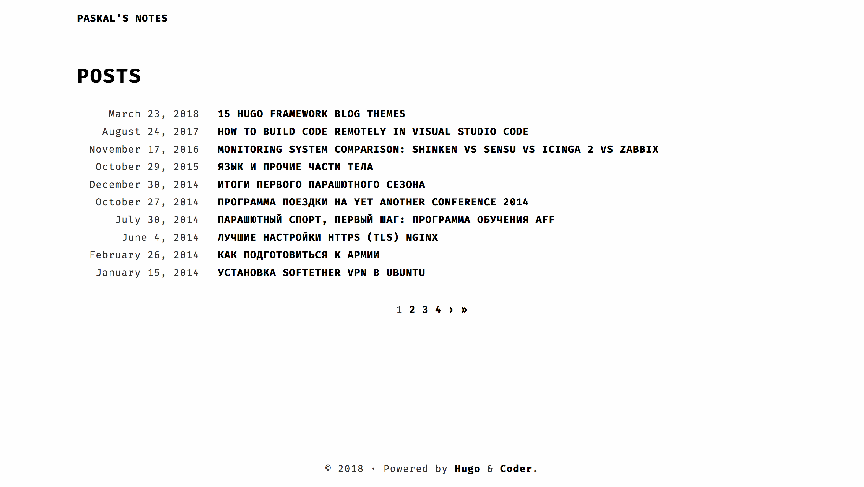
Simplicity at largest. Everything in its place, right font – and here comes your first impression.
Navigation
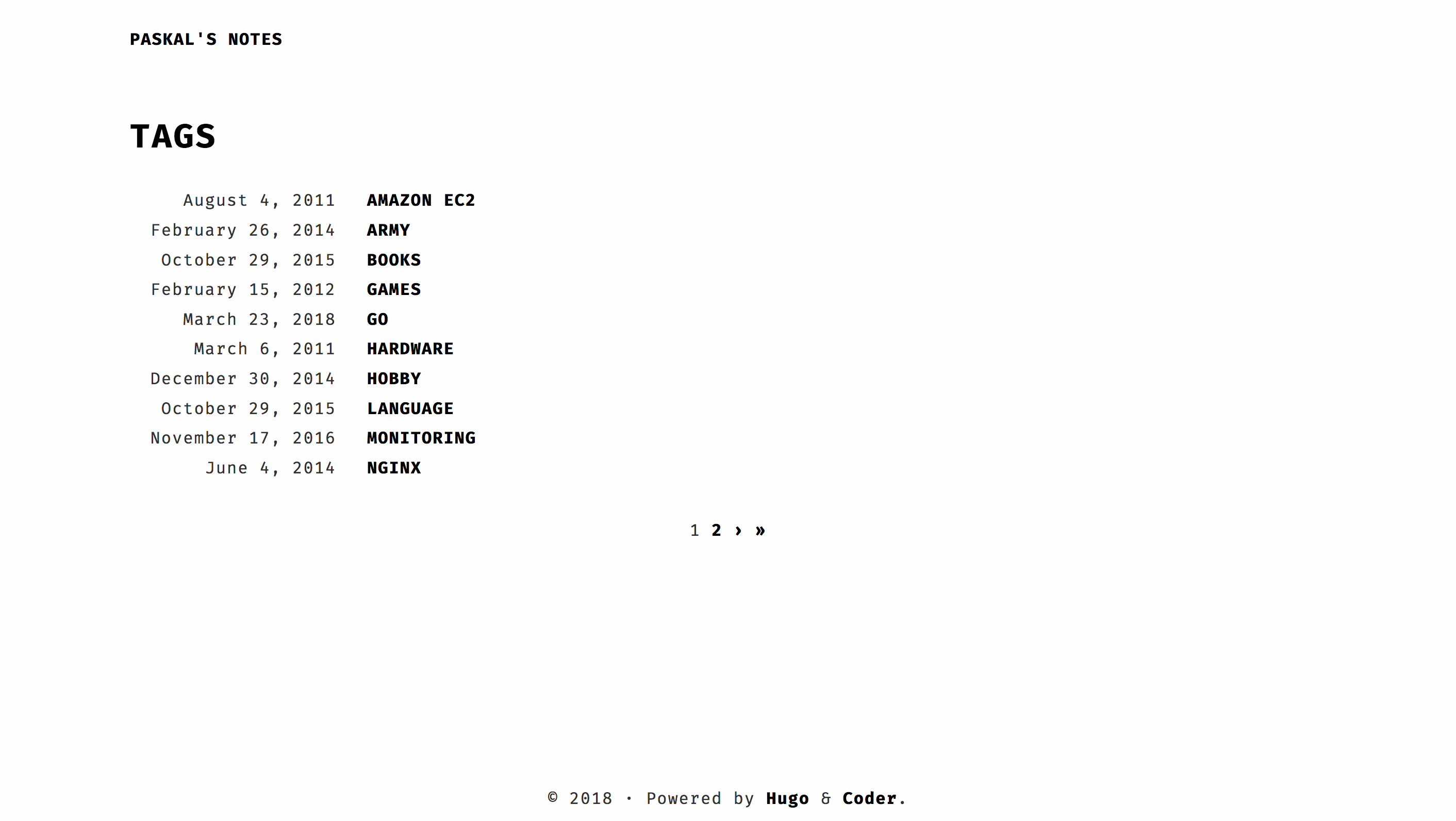
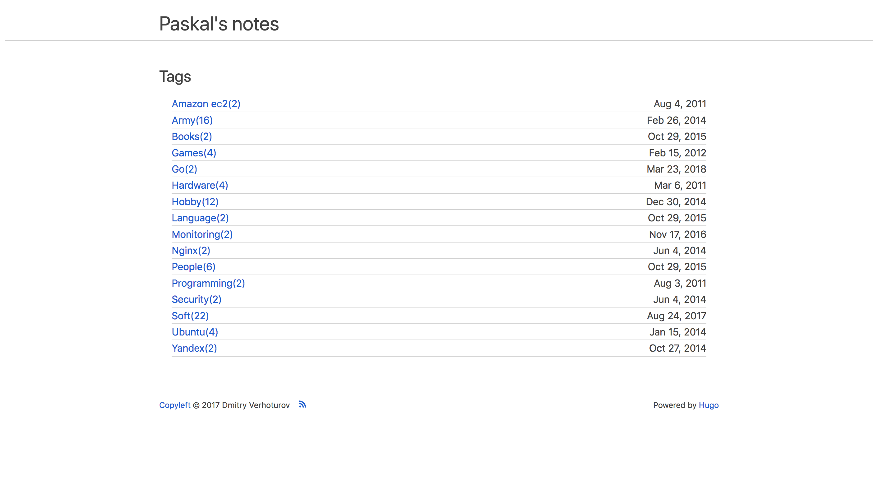
Posts page lacks both tags and summaries, but either one of them is better to be present. Tags lack frequency information but instead have a date of the last post, rare and remarkable.
Single page
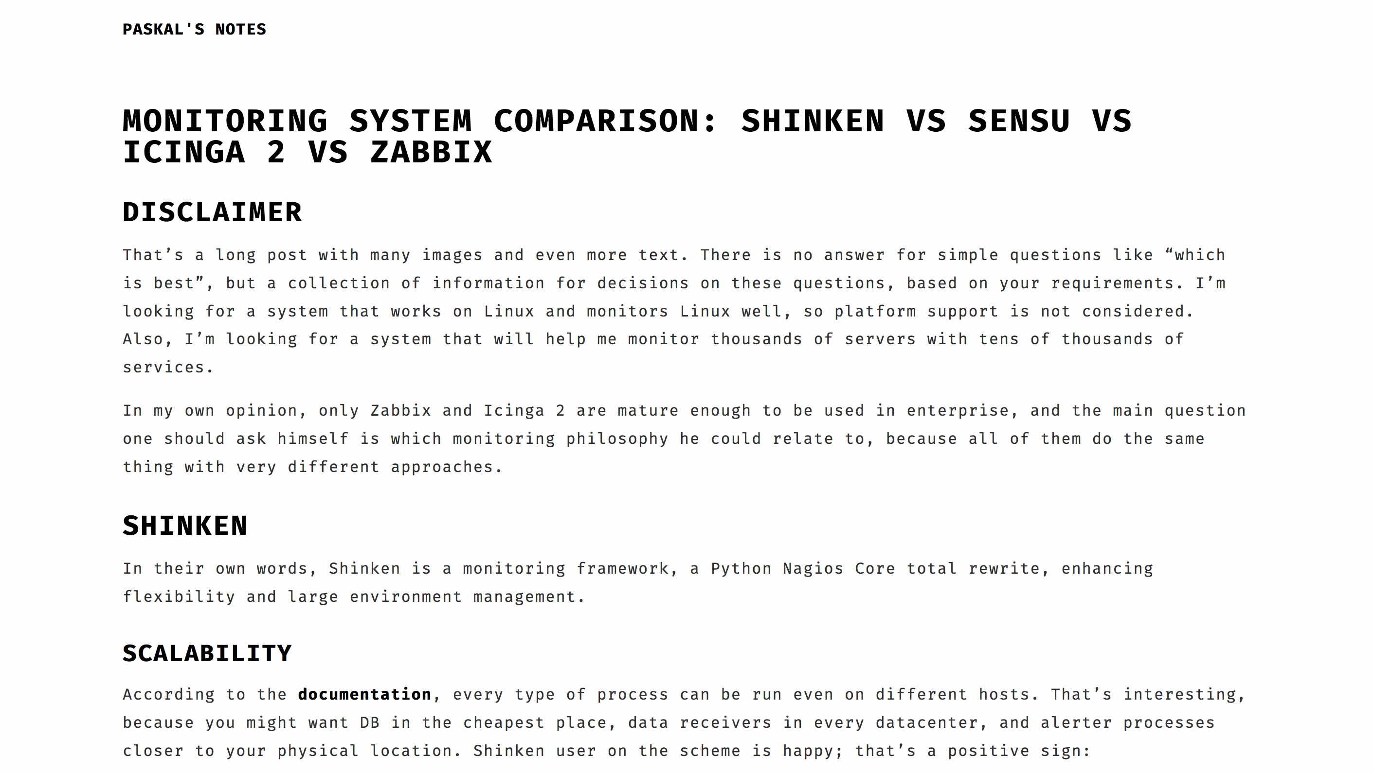
The widest post content out there with deep spacing between the lines, there is room for improvement for better readability and higher density, but it’s unique for sure, and someone might find this style appealing. No Disqus comments and no related articles list present yet.
Fabric
Main page
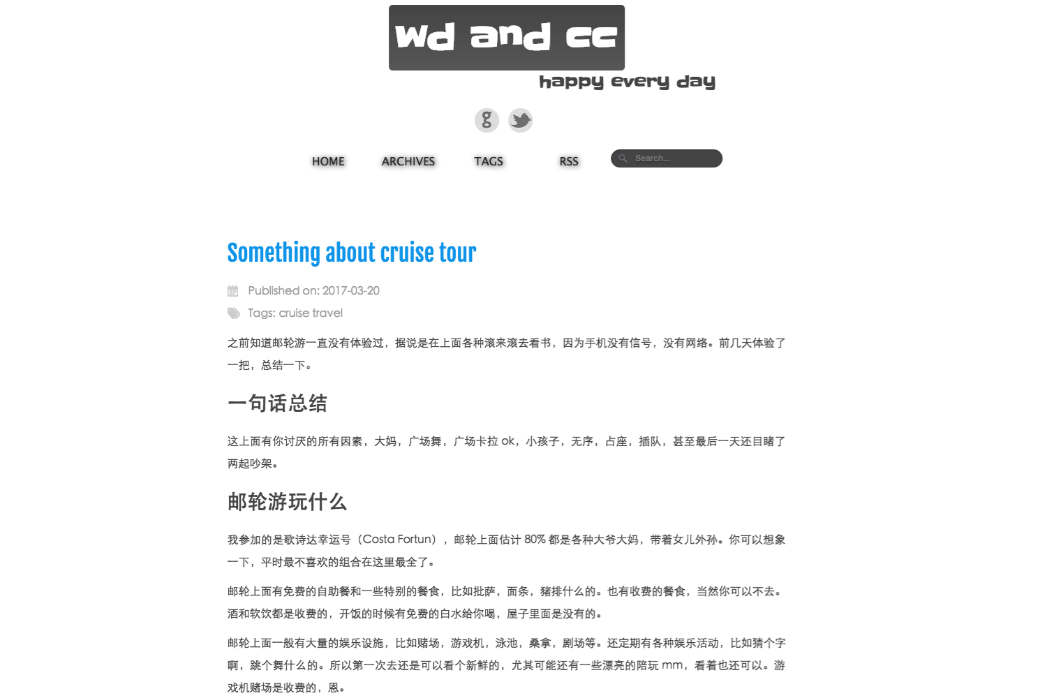
Simple yet unique and functional, and also includes working search field. On the cons side – posts are shown completely, not only summaries.
Navigation
Fabric’s posts page is the best navigation without summaries I’ve seen out there, all possible information present and rendered nicely. Tags page is small and leaves something to be desired (like sort by a number of posts in the tag), but functional.
Single page
Solid text renders without anything out of order. I’ve included a bit bigger screenshot than usual to show you neat shadow around the image and caption under it present in no other theme. Disqus support is there. However, no related articles list support.
Jane
Main page
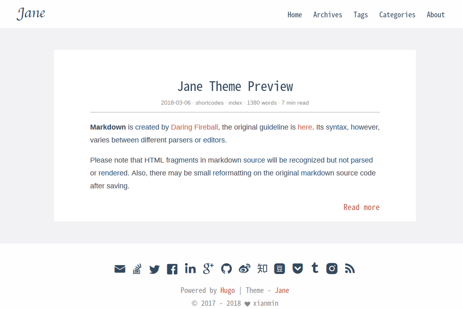
Classy simplicity, a pure text of the highest quality – that’s what Jane theme is about.
Navigation
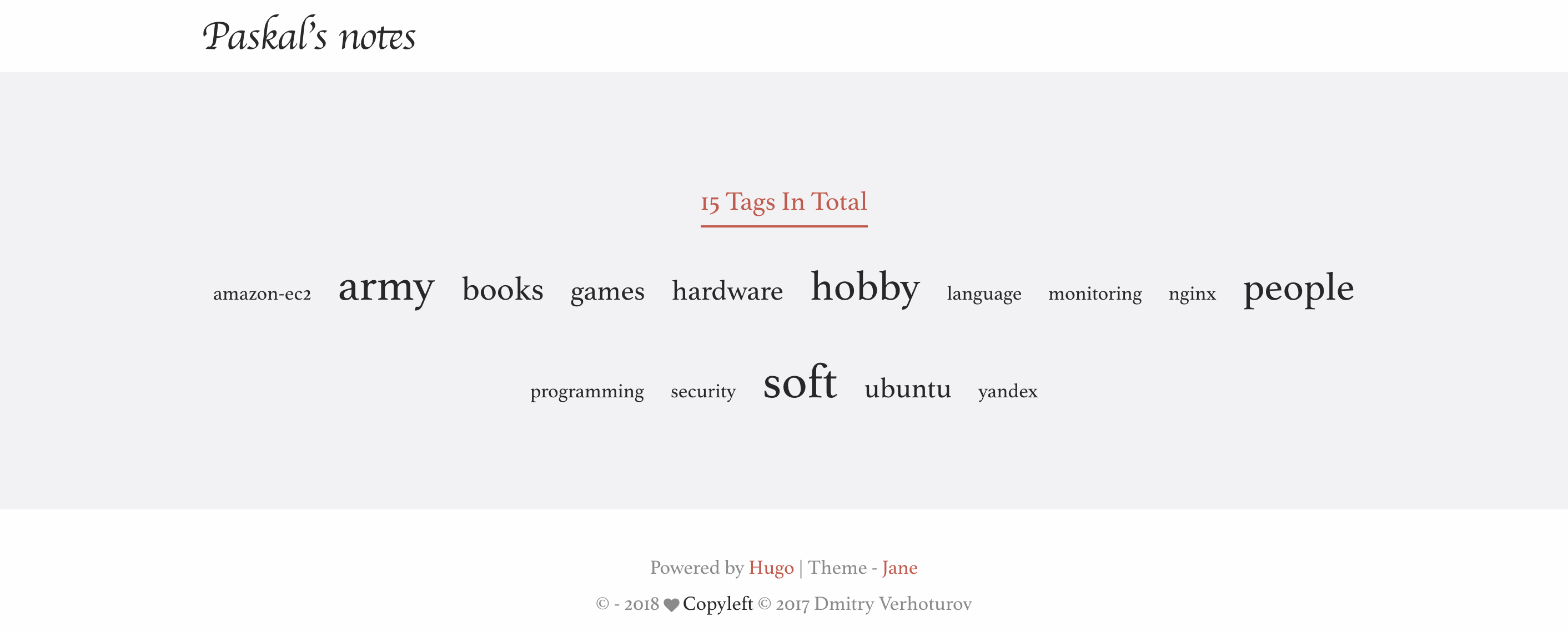
Tags look like you expect them to look but slightly better.
Single page
I’ve chosen another post to take the screenshot from because that’s something worth seeing: that colours choice is the best you could find. Posts that use a lot of formatting, quotes, images and code blocks shine in this theme. The author has good taste, which we might benefit from. Disqus comments supported but hidden by the “Show Disqus Comments” button not to distract you from the content itself. No related articles block, but it would be redundant on this text celebration.
Journal
Main page
Simplicity and nice fonts, what else do you need? No tags, no categories.
Single page
One of the most admirable fonts out there, with neat render with great attention to details. However, nothing else but post content is present, not comments nor related articles list.
Liquorice
Main page
Pure minimalism looks very solid.
Navigation
The same minimalism, but a little overwhelming this time — what is enough for the main page, is not enough for the tags page (e.g. information about how “big” the tag is missing). Posts list missing tags, which is pretty essential when you don’t show post summary.
Single page
Wide text block shows more text than any other theme in this list. Simple text renders without anything special about it, black and white palette: no related articles and no Disqus comments.
Manis
Main page
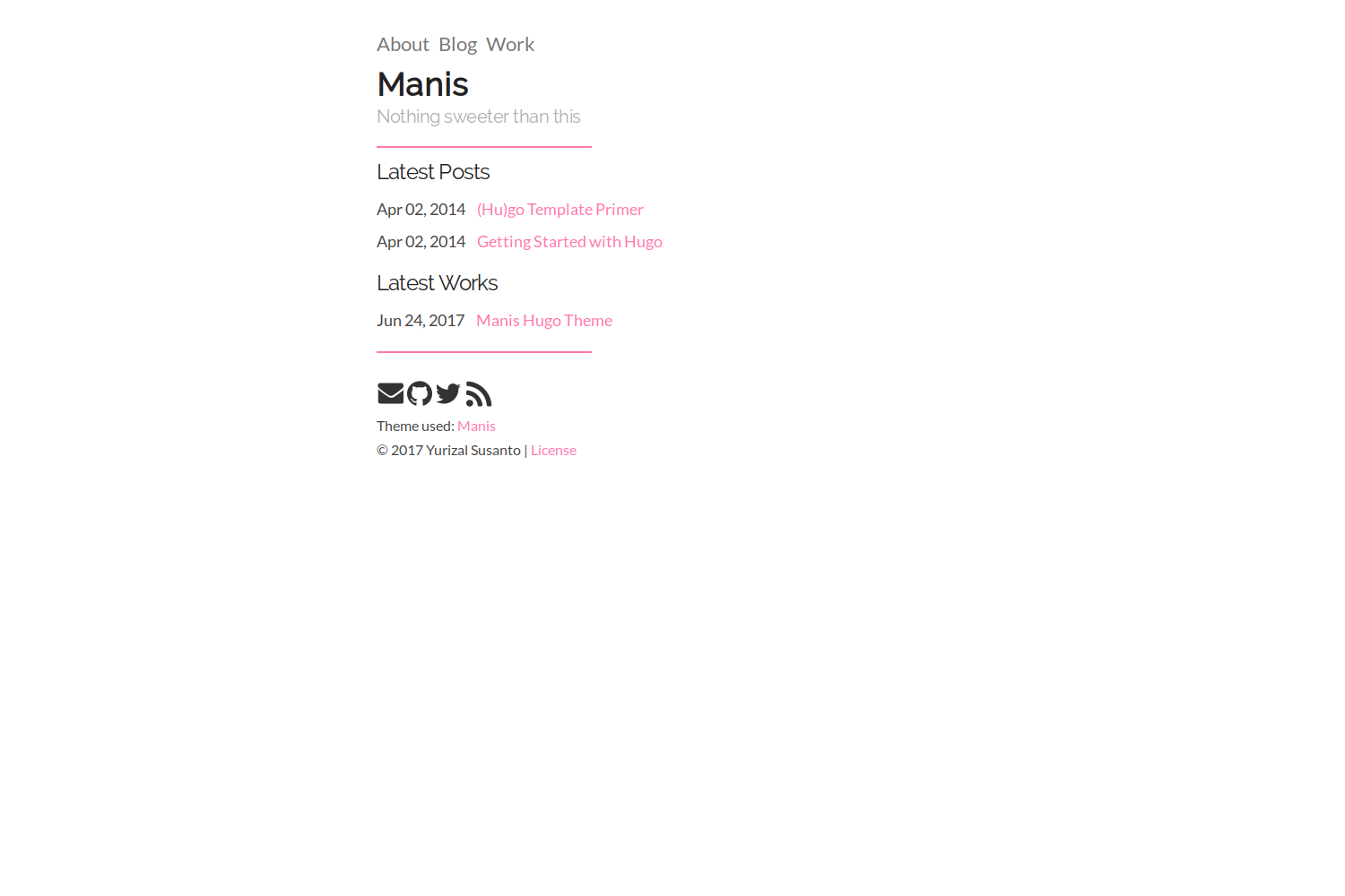
Another minimalism approach at its best.
Navigation
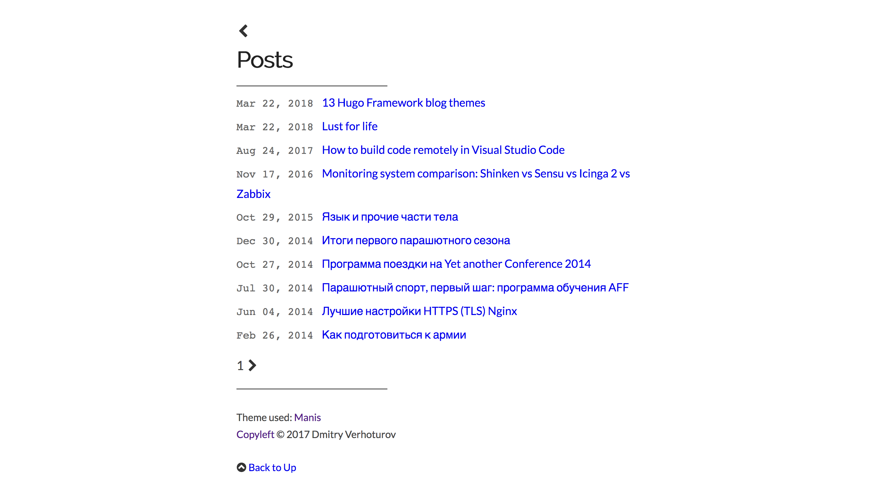
Fixed width text even on navigation pages, which is sweeter than candy. Tags won’t tell which one is most used, and posts don’t show tags which is important because of the absence of a summary.
Single page
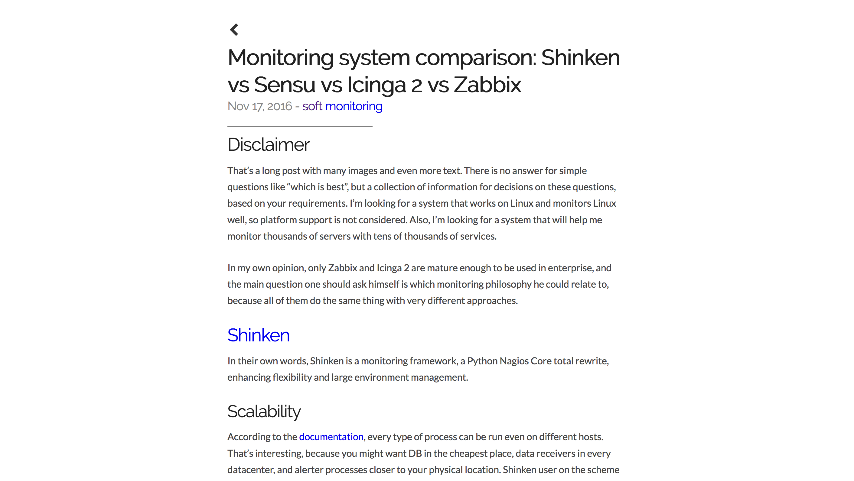
In line with main and navigational pages, post content and nothing extra. The text is rendered in an elegant way, quotation and source code blocks adjusted to be in style with the theme, and it’s done nicely. Only next\previous posts shown below, no related posts. Disqus comments support is present.
NOW-UI
Main page
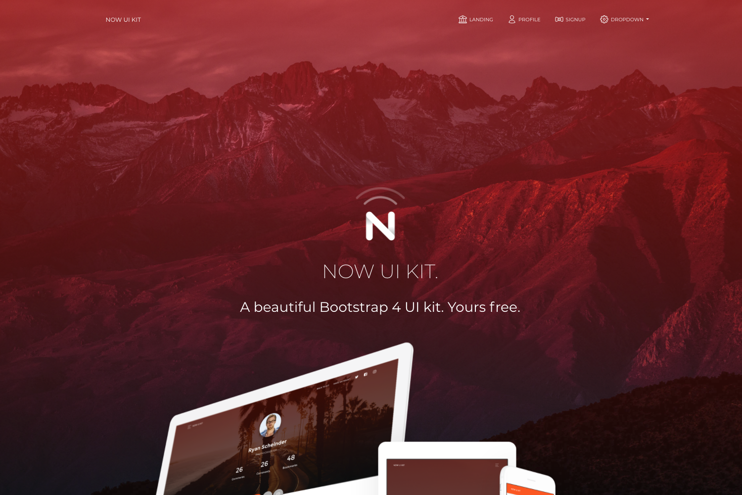
By the main page, you could say it’s not only a blog theme. The actual content is hidden somewhere where you should scroll and click, same with the posts page. It has a lot of features that are not related to blogging itself.
Navigation
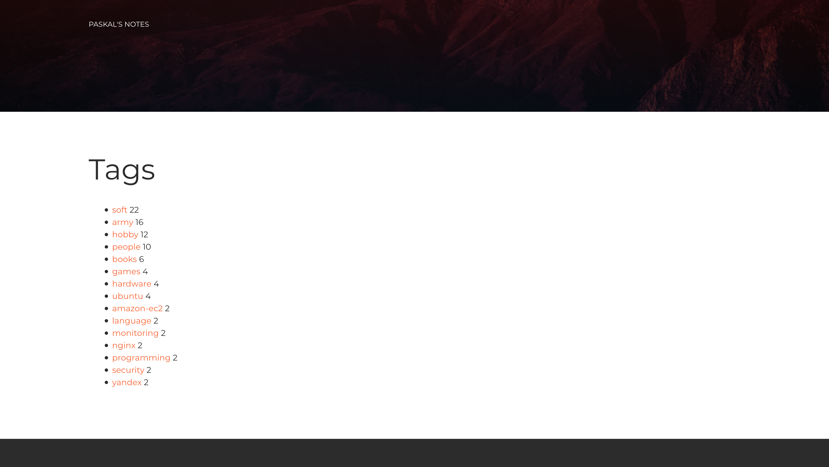
Like all other pages, the tags page has a ridiculous red banner on top, but under it is a pretty tags list sorted by how many posts with each tag the blog has, which is the best possible sort.
Single page
It’s better to see once for yourself. That big banner doesn’t seem to be doing anything useful, but magically it adds importance to whatever written on it and draws attention to the post title and description. The text is light and pleasant and utilizes a black, white and red palette: no related articles list or links to the previous article. However, Disqus comments are present.
Nofancy
Main page
That’s the only theme that chooses to show a single post instead of the main page. Everything is not fancy, in a good term.
Navigation
Navigation reminds me of Reddit. I like it a lot. It’s the best representation of the information you could get with staying that simple.
Single page
Nothing fancy there as well, black on grey with a bit of red. There are no related articles list, no Disqus comments, but with such design, it’s a plus and not a minus.
Refined
Main page
Underdog, which is yet not included in the catalogue. Nothing distracting, straight to the business, red on a grey palette. Posts descriptions instead of summaries, in between nothing and summaries, seems one of the best possible variants.
Navigation
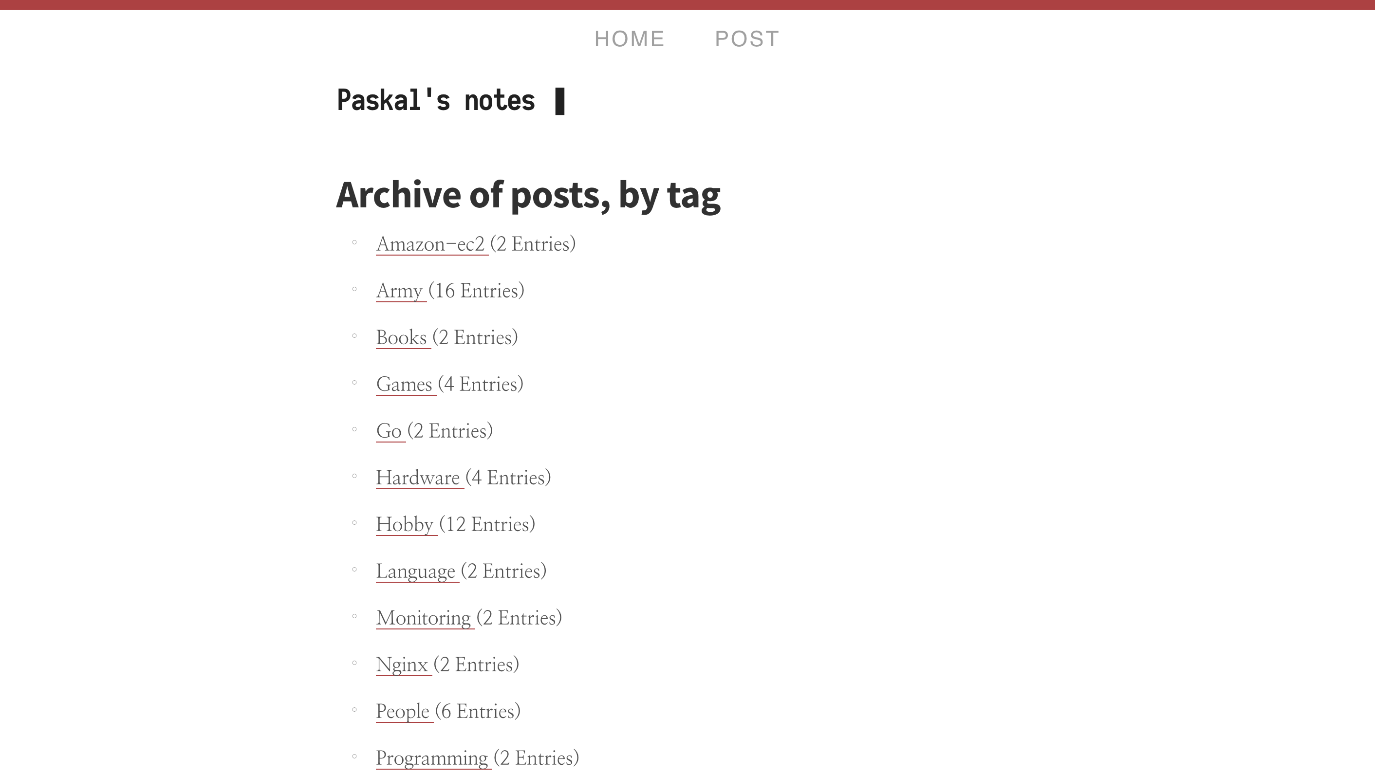
The posts page looks exactly like the main page. Tags have all the needed information and sorted alphabetically.
Single page
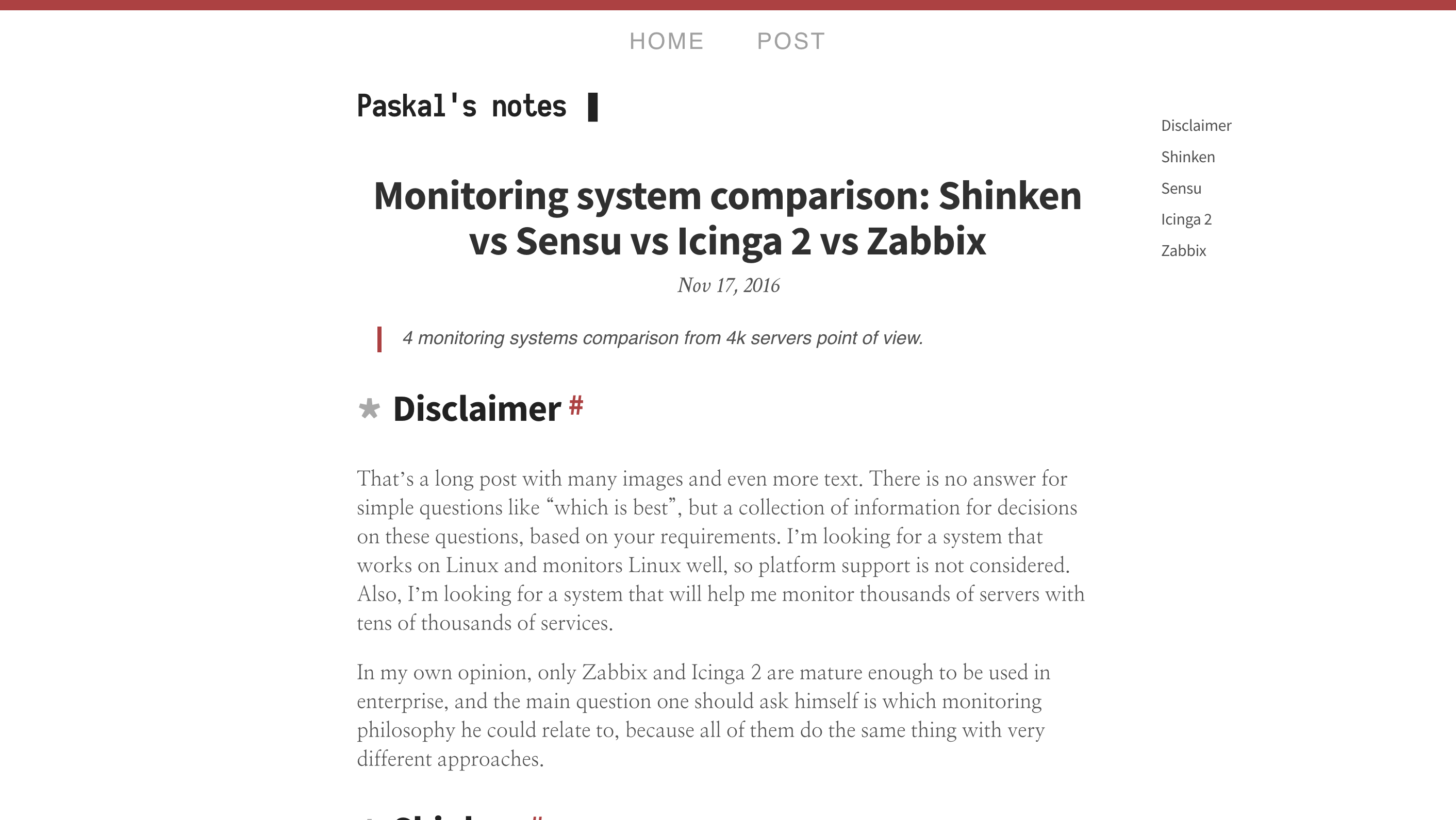
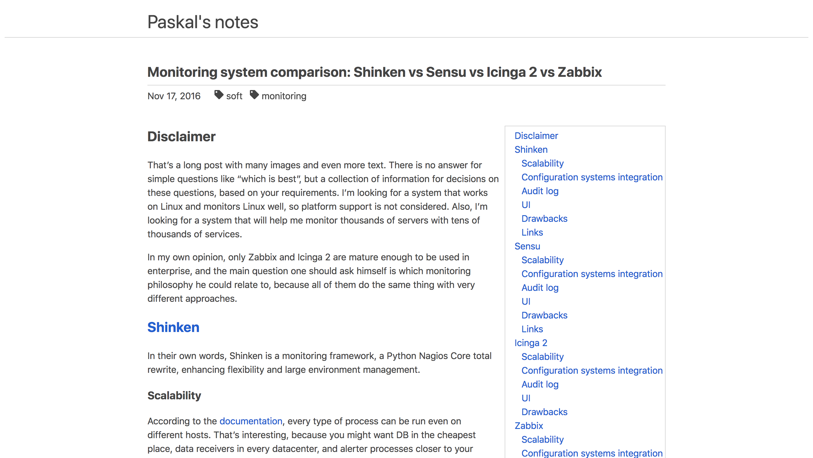
Unique design I’ve seen only once more in all 200+ themes, this theme almost directly quotes Markdown code from which the content is created (e.g. ## becomes *, ### becomes **, but they also still represent h2 and h3 HTML tags). If you think there is something unusual on the right, you’re right: that’s a nicely crafted table of content, one of two enabled by default from all themes there and done with the finest quality. No related articles, however next and previous pages links are present, and comments are in place, but they are Isso in addition to Disqus.
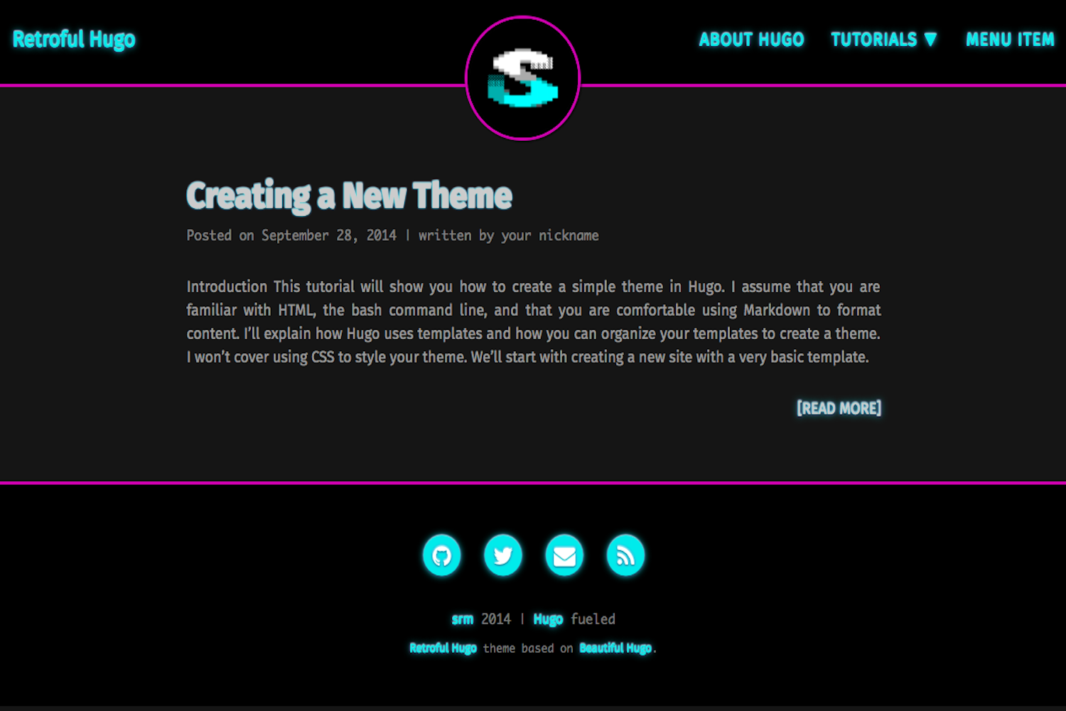
Retroful Hugo
Main page
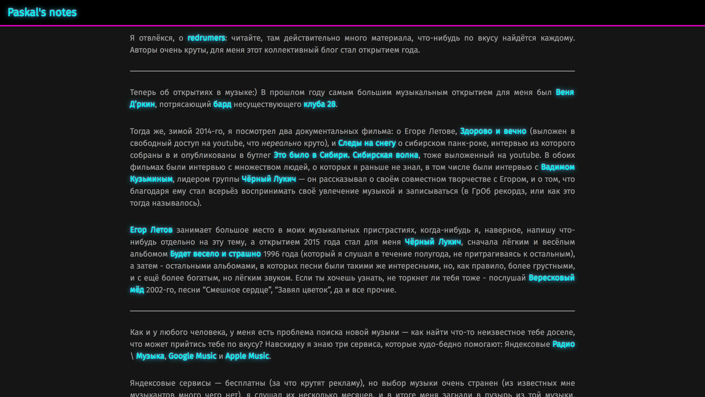
“Cool” is the last thing you could say when you see this theme. I guess you could either love or hate it, but nothing in between. Sadly I wasn’t able to set up navigation correctly.
Single page
It looks like I imagine 80’s terminals, but in a way, there were redefined in Alien (1979), and also it refers to Tokyo neon lights from Bladerunner (1982). No related articles (but previous\next post link present), but Disqus comments are supported.
Whiteplain
Main page
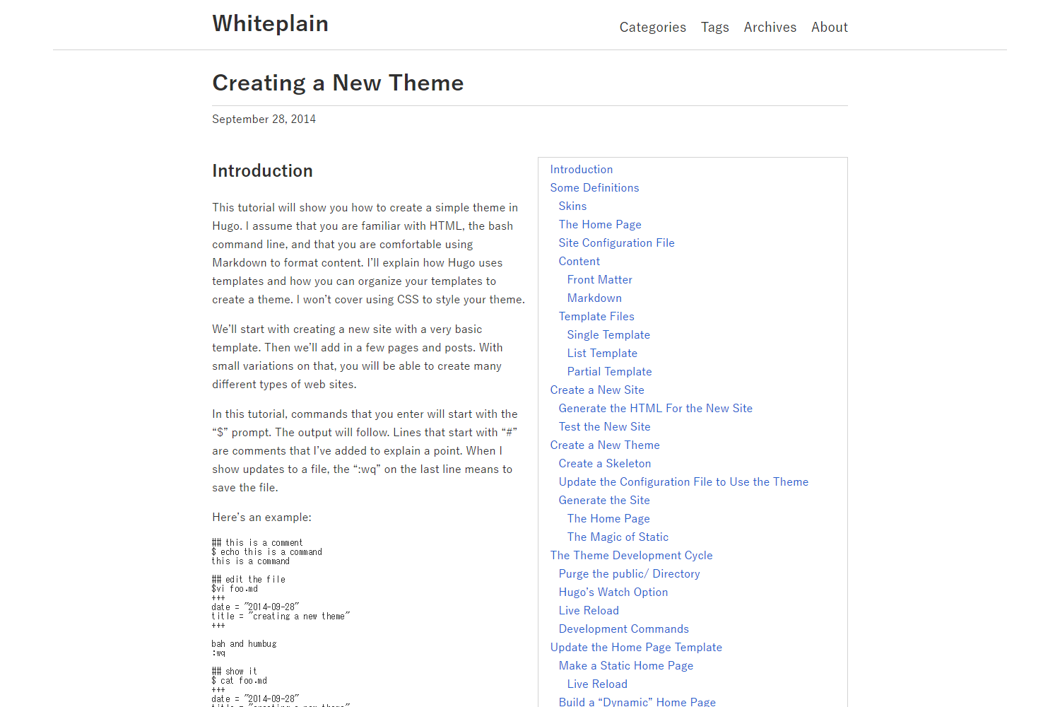
Black, white and blue palette, everything is self-explanatory and assembled with great care. Also, you could notice that’s one of the themes with the table of content-enabled by default.
Navigation
The posts page is the same as the main page and tags page, only the title changes. Posts are listed with summaries and all the metadata. Tags are the best out there; they have maximum metadata presence plus alphabetical sort – my heart is with these tags.
Single page
The text is not fancy but very solid and readable and has no distracting elements, which some themes tend to use (like quotation boxes). Disqus support is in place, next\previous post navigation but no related articles (which could look alien there).
